The Power of Color in Marketing, Branding, and Exhibition Stand Design
Understanding the Psychology of Color
The psychology of color plays a crucial role in influencing human emotions and behaviors. And this principle is extensively applied in marketing and branding strategies. Different colors can evoke specific feelings and reactions, which marketers take advantage of to enhance consumer engagement. For example, research shows that blue often associated with trust and dependability. This makes it a popular choice for financial institutions and healthcare brands. Similarly, red tends to evoke strong emotions such as excitement and urgency, prompting quick purchasing decisions—hence its frequent use in sales promotions and clearance advertising.
Furthermore, the power of color in marketing extends to its influence on brand perception. Brands that strategically incorporate colors into their identity can shape how consumers view them. For instance, green is widely linked to health and sustainability, prompting many eco-friendly brands to utilize this hue. This connection not only helps in establishing a brand’s character but also assists consumers in forming emotional attachments to the products or services offered. A study published in the journal “Management Decision” highlighted that color affects 60-80% of the decision-making process for consumers, demonstrating its significance.
Moreover, the application of colors in exhibition stand design cannot overlooked. The choice of colors can impact foot traffic, draw attention to key products, and create an inviting atmosphere that encourages interactions. By leveraging the psychological effects of colors, businesses can enhance their marketing strategies and ultimately influence purchasing behavior. Specific hues can stimulate appetite, convey luxury, or instill feelings of comfort, depending on the target audience and event. Therefore, understanding the unique attributes of colors in relation to human psychology is essential for marketers aiming to optimize their branding and exhibition strategies effectively.
Color in Branding: Creating Visual Identity
Color plays a pivotal role in branding, serving as a key element in establishing and reinforcing a brand’s visual identity. The decisions made regarding color palettes can profoundly influence how a brand perceived, thereby affecting its success in the market. Brands invest significant time and resources in selecting colors that embody their values and resonate with their target audiences. For instance, the calming blues of a tech company may evoke feelings of trust and reliability, while vibrant reds in a food brand can stimulate appetite and excitement.
Taking a closer look at successful brands, companies like Coca-Cola use a striking red hue that conveys energy and passion, aligning perfectly with their lively branding strategy. On the other hand, Tiffany & Co. has created an iconic association with its distinctive robin’s egg blue, symbolizing luxury and timelessness. These color choices contribute not only to the brand’s identity but also to a strong emotional connection with consumers.
Consistency in color usage across various platforms is critically important for effective brand recognition. A consistent color scheme helps solidify a brand’s image and makes it easily identifiable, whether on packaging, advertising, or digital platforms. This uniformity ensures that the target audience instantly recognizes the brand, thus reinforcing their overall perception. Moreover, the psychological impact of color is significant; it creates associations and stimulates emotions that drive consumer behavior.
In establishing a brand’s visual identity, the power of color in marketing cannot overlooked. By thoughtfully selecting a color palette that aligns with brand values and audience expectations, businesses can effectively communicate their message and cultivate a loyal consumer base. This strategic use of colors in exhibition stand design can further enhance brand presence at events, leveraging the inherent psychological responses elicited by color.
The Impact of the Color in Marketing Campaigns
Colors play a pivotal role in marketing campaigns as they can significantly influence consumer behavior. Research indicates that color can improve brand recognition by up to 80%, making it an essential factor in the design of advertisements, product packaging, and digital marketing materials. The strategic use of colors allows marketers to capture attention, convey messages, and drive engagement, effectively communicating brand identity and values simultaneously.
When choosing colors for advertisements, it is imperative to consider the psychological impact associated with different shades. For instance, blue often evokes feelings of trust and dependability, making it a preferred choice for financial institutions. In contrast, red is associated with excitement and urgency, thus commonly used in clearance sales to stimulate immediate purchases. Marketers must align the color choices for their campaigns with the desired emotional response from the target audience, creating a harmonious relationship between the product and consumer perception.
Product packaging also serves as a canvas for the application of colors in exhibition stand design. For example, the green color palette is frequently employed for organic products, as it signifies health and sustainability. Companies such as Whole Foods have successfully incorporated vibrant colors in their branding to reflect freshness and quality, resulting in increased sales and customer loyalty. Furthermore, in the realm of digital marketing, the implementation of colors in website design and social media campaigns can enhance user experience and engagement, influencing click-through rates and conversion metrics.
Marketers aiming to choose the right colors to match their campaign objectives should conduct a comprehensive analysis of their audience’s preferences, cultural meanings of colors, and contextual implications. By understanding the power of color in marketing, professionals can make informed decisions that not only captivate attention but also foster long-term brand loyalty, ultimately leading to successful campaign outcomes.
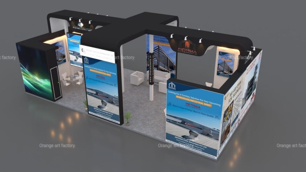
Designing Exhibition Stands: The Role of Color
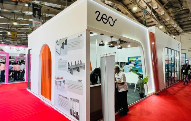
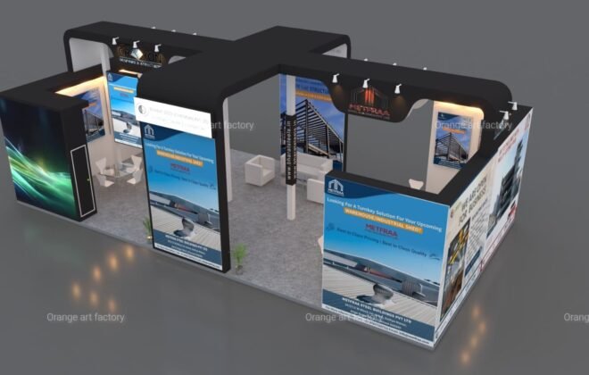
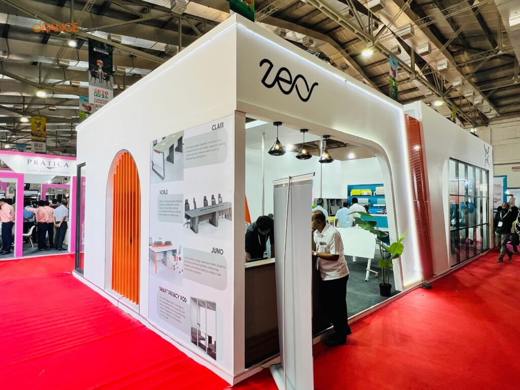
In the competitive landscape of trade shows and exhibitions, the significance of colors in exhibition stand design cannot be overstated. The strategic use of color not only influences visitor perceptions but also plays a pivotal role in enhancing brand recognition and recall. Understanding the power of color in marketing allows businesses to create stands that capture attention and foster engagement. Through a well-thought-out color palette, companies can evoke specific emotions and convey their brand identity effectively.
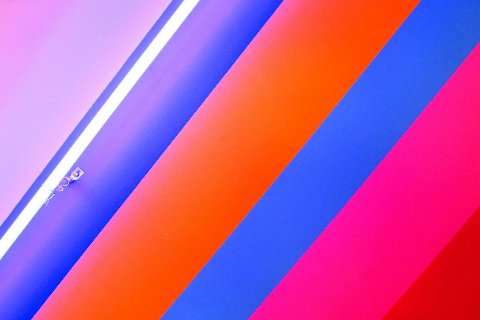
One of the foundational principles of color use in exhibition stand design is contrast. High contrast between colors can create visual interest and draw the eye to crucial elements of the exhibit. For instance, pairing vibrant colors with neutral tones can highlight key messages or products prominently displayed in the stand. Additionally, harmonious color schemes promote a sense of cohesion and professionalism. By ensuring that colors complement each other, brands can foster a comfortable atmosphere that encourages attendees to explore the exhibition space further.
When designing an exhibition stand, it is also essential to align color choices with branding strategies. Each color is often associated with particular psychological responses; for example, blue may evoke feelings of trust and reliability, while red can signal excitement and urgency. Thus, businesses should carefully select colors that align with their brand values and resonate with their target audience. Furthermore, practical tips for maximizing color impact can include the strategic placement of colors to create pathways or focal points, leading visitors through the exhibit seamlessly.
Incorporating the principles of color contrast, harmony, and branding enables businesses to design exhibition stands that are not only visually appealing but also effective in drawing in potential customers. The right use of colors can transform an ordinary exhibition stand into an inviting space that promotes interaction and enhances the overall visitor experience.
Article by: Vinoth Kumar
